Graduate Research Project
Typography may be described as, “the craft of endowing language with a visible form” and “an independent existence” (Bringhurst 2005: 11). However, the argument may be made that typography, in the modern era of desktop publishing, with its associative, commercial publishing applications, affords the non-expert with much greater control of the visual organization of writing than they traditionally have had. “It is no longer the that typography is solely the province of the professional, and the influence of the non-expert typographer on the vial organization of writing is becoming an increasingly important shaper of our graphic language.” (Walker 2001: 2)
Typography is the visual appearance of written language in print; including not only the choice and the design of the typeface, to which the term is frequently limited in ordinary language, at least in the Western mindset. However, it must be noted that typography includes the visual appearance in a general sense, that is, the arrangement and design of the letters in the line as well as the arrangement of the text on the page (the layout), the color scheme, the placement of images and even the choice of the delivered medium.
The aforementioned aspects are important because they possess the potential to refer to a specific value system and thus can be used to express values, attitudes, and associations; such as instant brand recognition, or a sense of location based upon the associative principle of a typeface with a geographic place (the New York Subway systems exclusive use of Helvetica on its signage for example). In essence, typography is an important form of urban communication, significant not only for its aesthetic appeal, but because of its near-anthropological importance as a marker of regional identity, its way of creating and preserving a sense of place, and its role as a symbol of local culture and history. Examples of this phenomena include the look and presentation of propaganda posters during the Cold War, street tags and graffiti associated with the New York public transportation system during the late 1970s and throughout the 1980s, the album artwork of the 1950s and 1960s (especially the Blue Note label), and the technology boom of the past 25 years, wherein typefaces have become sleek, clean, robotic, and technical looking. Each of these presentations carries with it a distinct and memory-jogging mental picture, allowing the viewer to associate with the era on display.
The typographic examples below provide, in my opinion, a modicum of accountability when speaking of the aforementioned concepts. Each has, in its own rite, a significant level of associations that can be drawn to the real-world. Furthermore, each typeface has carved for itself a specific place in the way we, as both consumers and communicators, cognitively process visual information based upon repeat viewings and experiences.
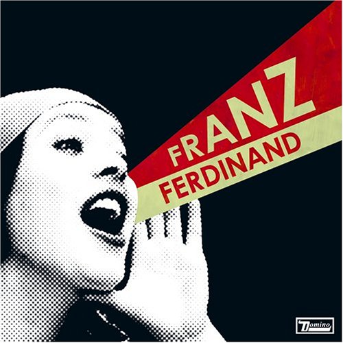
Helvetica
If ever there was a font that has stood the test of corporate branding it would be Helvetica. This font has been used by the largest corporations in the world and is still being used in logo designs an posters everywhere. Just a few of the companies and corporations that have utilized Helvetica in their logo and or branding design(s) are:
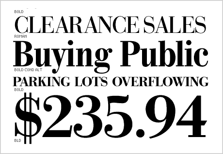
Bodoni, a series of typefaces, developed by Italian Giambattista Bodoni, is classified as Didone modern. Bodoni followed the ideas of JOhn Baskerville, as found in the printing type Baskerville, that of increased stroke contrast and a more vertical, slightly condensed, upper case, but taking them to a more extreme conclusion. (Frey 2006: 1)
Bodoni himself has a long career, and his deisgns evolved and differed, ending with a typeface of narrower underlying structure with flat, unbracketed serifs, extreme contrast between thick and think strokes, and an overall geometric construction.
The fonts use has been rather widespread since its beginnings; being utilized for a wide variety of material from 18th century Italian books to 1960s periodicals. It is also still seen in modern advertising, as the nameplate of a few popular fashion magazines, as the font of choice on the majority of Tom Clancy's novels, as the logo of 90s grunge band Nirvana, and as the logotype currently used by musician Lady Gaga.
An example may be seen here
The news hour with jim Lehrer.
Just a few short years ago, Calibri replaced both Times New Roman, and Arial, to become the default font within Microsoft's Office suite of applications. Although Calibri may not be plastered across subways throughout the world, the fact that it is a default setting in what is arguably the most widely used word processing application across the globe speaks volumes as far as its reach.
The typeface was designed by Lucas de Groot for Microsoft in order to take advantage of Microsoft's ClearType rendering technology (LucasFonts 2011: 1).
Bringhurst, Robert (2005): The Elements of Typographic Style. Version 3.1. Point Roberts, Washington/Vancouver: Hartley & Marks.
Walker, Sue (2001): Typography and Language in Everyday Life: Prescriptions and Practices. London (Language in Social Life Series).
Frey, David (2006): X-Height FontHaus's Online Magazine. DsgnHaus, Inc.
LucasFonts (2011): Case Study: Calibri and Consolas.